Multi-node tree picker in uComponents v1.0 BETA
The uComponents team has been hard at work trying to get this project launched and finally we managed to get a beta out last week. Woot! Hopefully we can get the RTM out within a week or two and get a few of those bugs fixed. The package is listed on Our.Umbraco here, be sure to vote for it if you like it.
The Multi-node tree picker is one of the 17 data types that can be found in uComponents (only 13 are available in the beta). This is essentially a content or media picker that can select multiple nodes that can then be sorted and saved to a document type… it’s also packed full of fun features!
Here’s what it can currently do
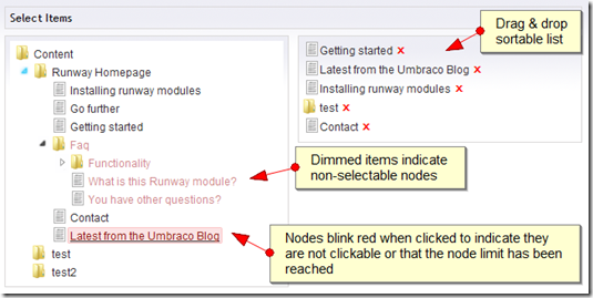
Drag & drop sortable list
The nodes on the right can easily be sorted by simply dragging and dropping them in the order you’d like them
Tree syncing
When the nodes on the right hand side are clicked, the tree on the left hand side will sync to that node so that your content editors can see where that node originated.
UI indicators
- Dimmed nodes indicate nodes that cannot be selected based on the XPath filter specified in the pre-value editor for the data type
- When nodes are clicked and the max node selection limit has been reached, or the node is not a selectable node, the node will quickly blink red
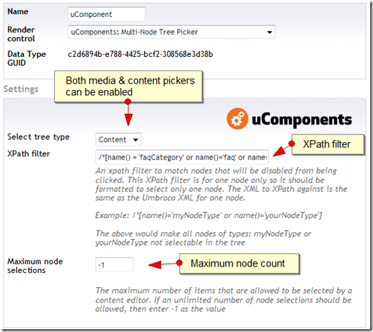
Media & content pickers
The data type can be customized to allow a content or media picker. Future version will most likely allow for other types of data.
XPath filter
An XPath fliter to match nodes that will be disabled from being clicked. These nodes will be dimmed (as seen in the first screen shot) when the editor is rendered.
Maximum node selections
A negative –1 value will mean that the editor is able to select an unlimited number of nodes. If a positive number is entered, the content editor will only be able to select the number of nodes defined here. If they attempt to select more than the amount defined, the node will blink red (as seen in the first screen shot).
Here’s what I’d like it to do
Hopefully I can get most of these ideas into the RTM release of uComponents
Thumbnail preview for media selections
When Media is the source of the picker, it would be great to render the thumbnail of the media item (if it’s an image) on the right hand side with a link to view the full image.
UI Indicator for already selected nodes
It would be cool to have a custom background color for nodes in the tree that are already selected on the right hand side
Custom tooltips with detailed information about selected nodes
When an item on the right is hovered over, a custom tooltip (or similar) should be displayed with the item’s path and ID
Limitations
Once of the limitations of this control that a few people have asked for is the ability to select a starting node for the tree. The reason that this isn’t implemented is because this is already implemented in standard tree security. The trees rendered in this control respect the same security principles as the standard content & media trees. It would be slightly confusing to be able to assign a start node ID on a tree twice as in some cases, based on security, a content editor might not see any nodes rendered for a tree. Perhaps this can be implemented in a later release if people really want this functionality but will probably not be included with v1.0.
Currently this data type saves the data as XML into Umbraco. Though this works great for XSLT, there’s issues in Umbraco that don’t return the XML data stored when using Node factory or Linq to Umbraco. In Umbraco version 4.5.2, the Node factory issue is fixed but the Linq to Umbraco issue still remains. Because of this, I will probably add support to the Multi-node tree picker to allow the developer to choose how they would like the data stored; either has comma delimited or XML.

